

Project Name:【白色至上设计】白色清霁体 | 字体设计应用示例
Design:白色至上设计
Art Director:LAI_CANWEI 赖灿伟
Graphic Design:LAI_CANWEI 赖灿伟
Art Director:LAI_CANWEI 赖灿伟
Graphic Design:LAI_CANWEI 赖灿伟
Year:2020
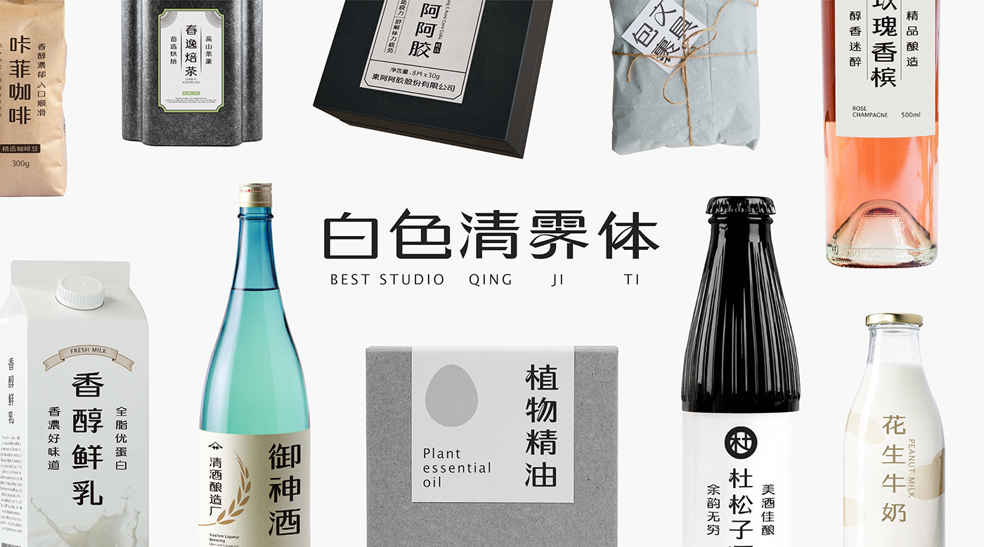
Project Introduction:早前便希望设计一款标题字,在适用于产品包装或者场景大标题之外,也可以兼具设计美感。
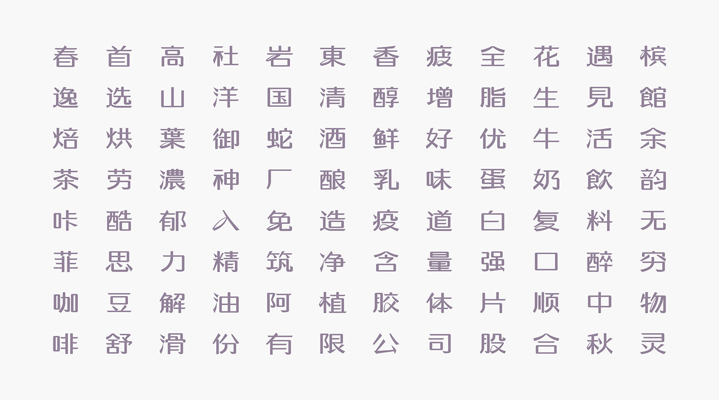
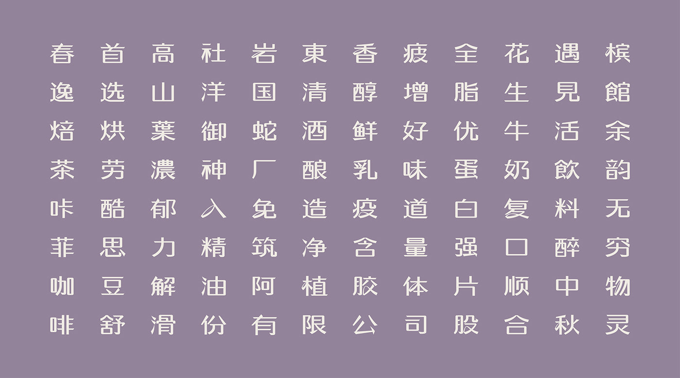
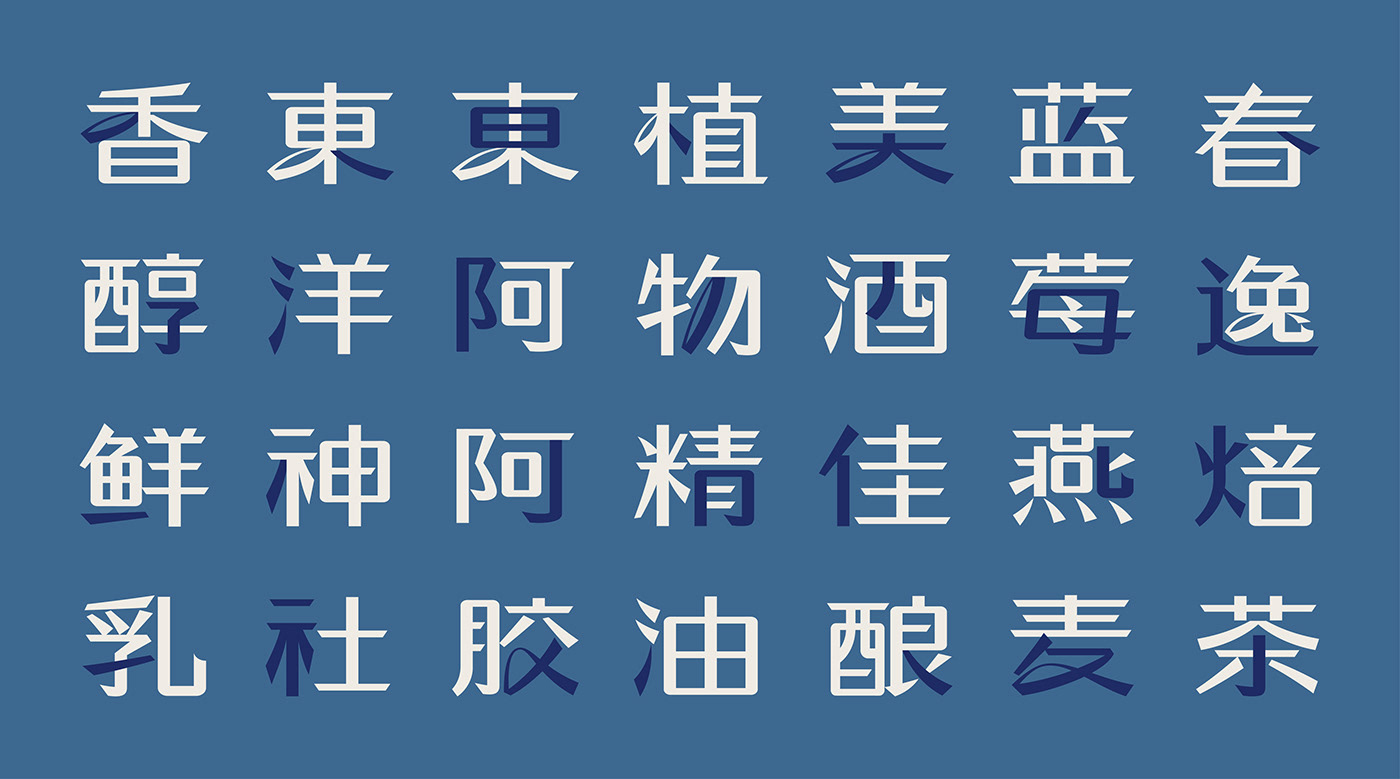
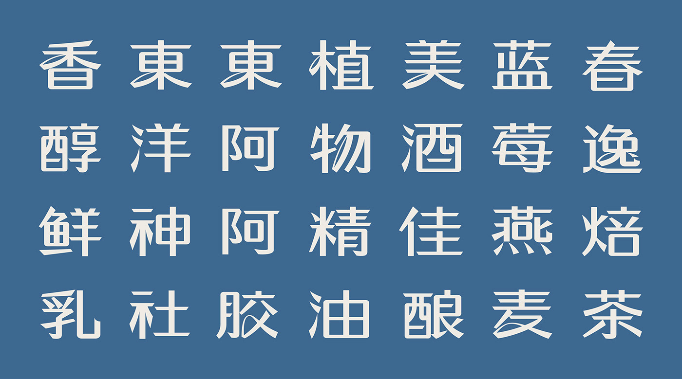
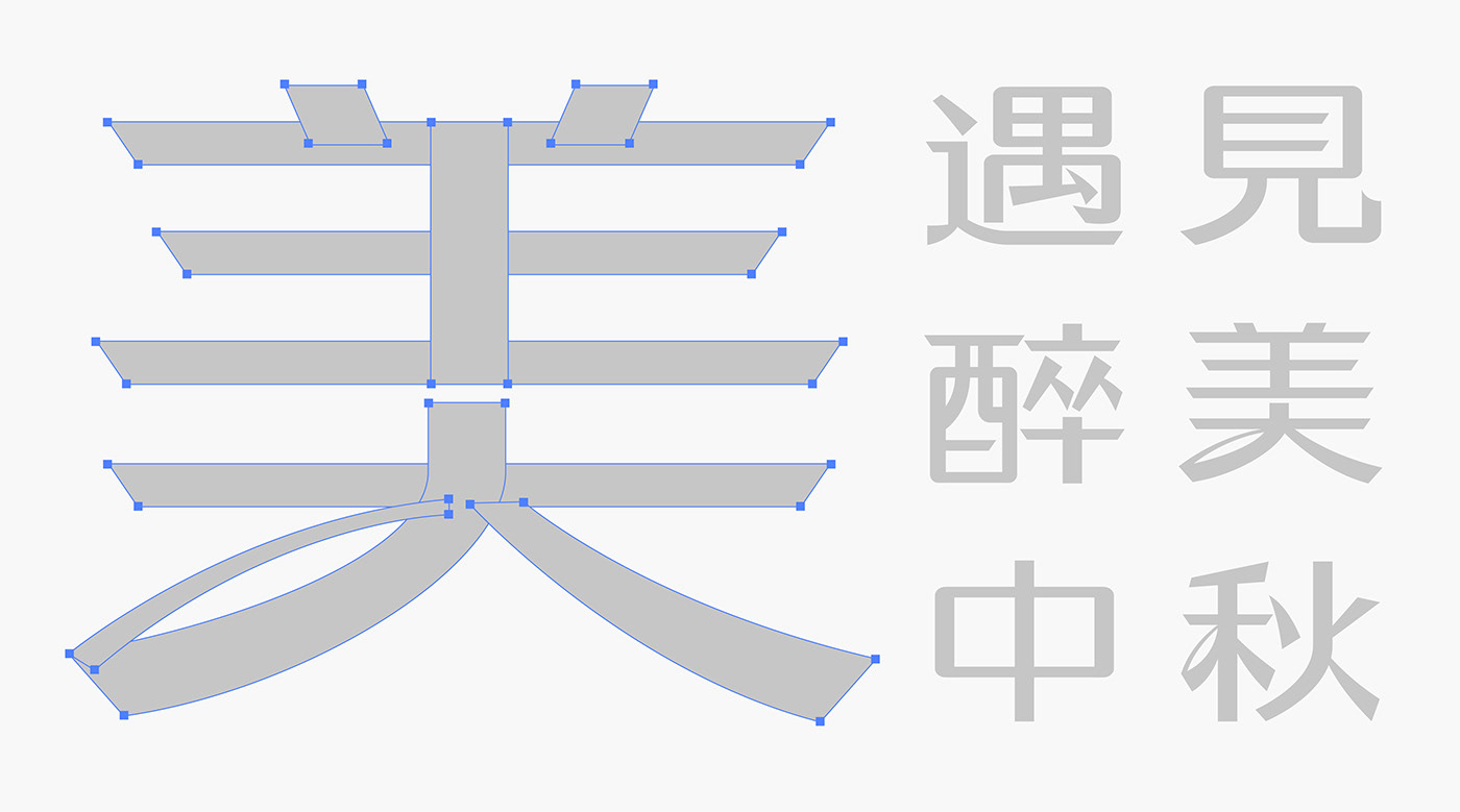
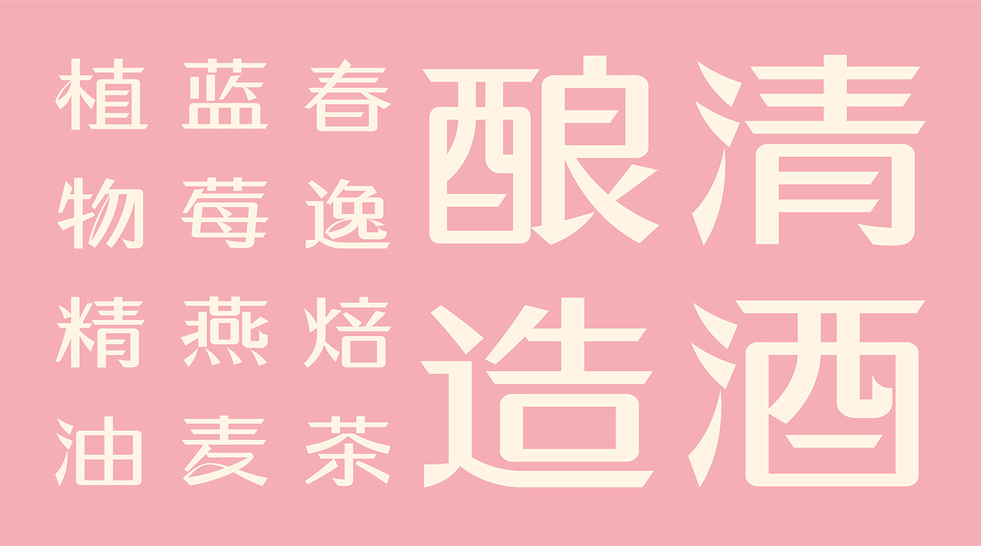
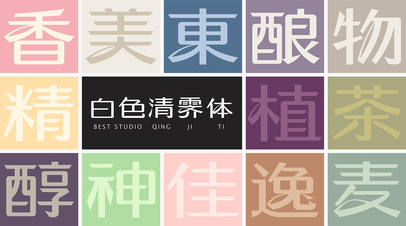
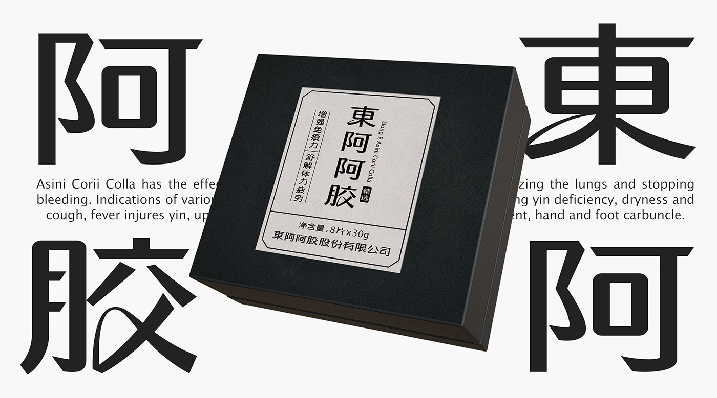
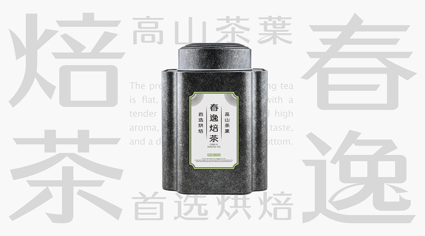
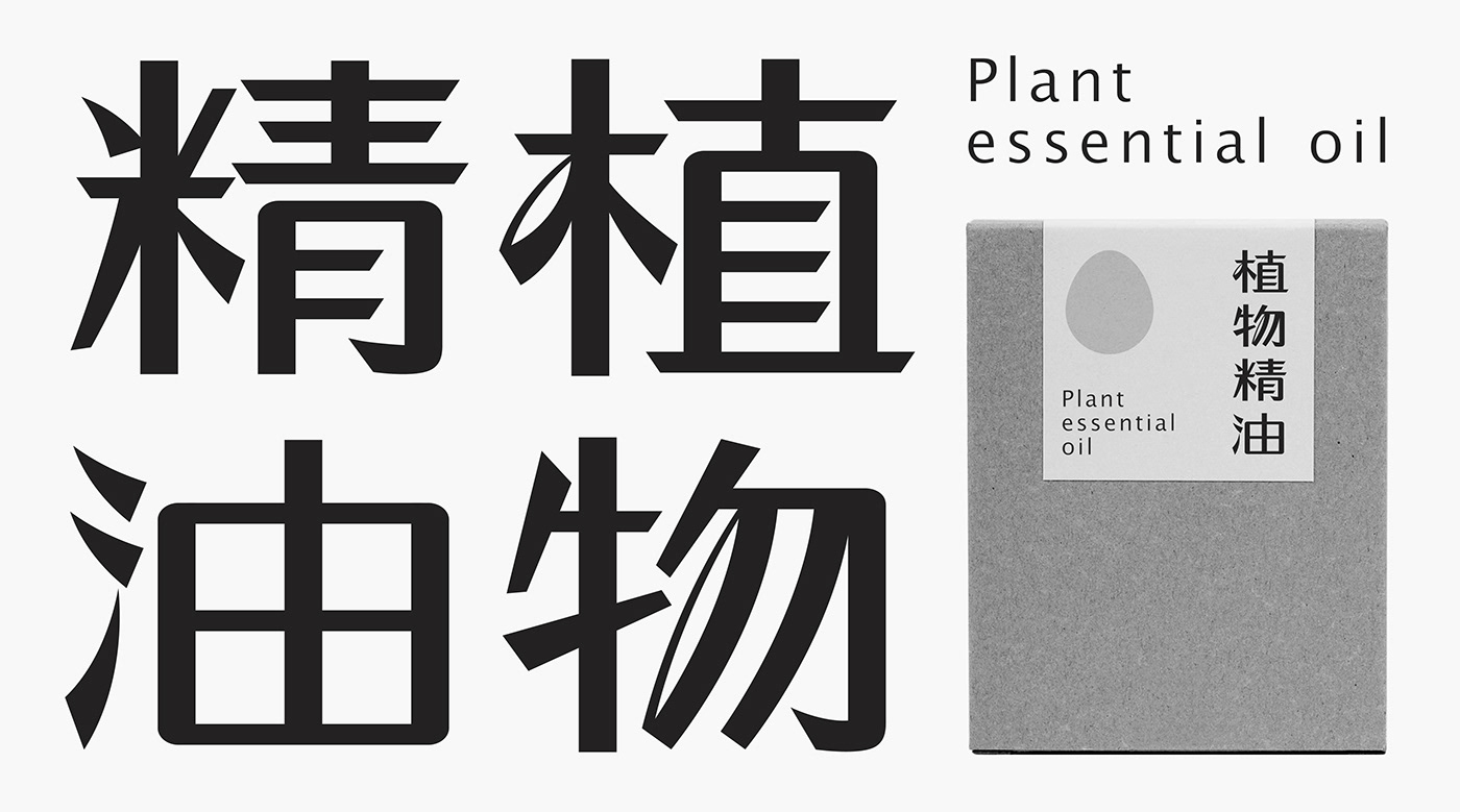
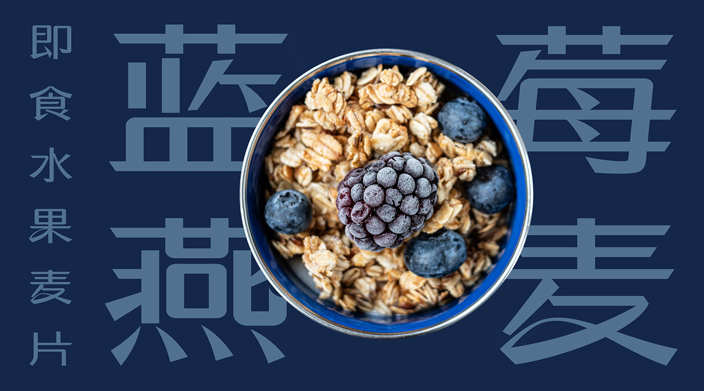
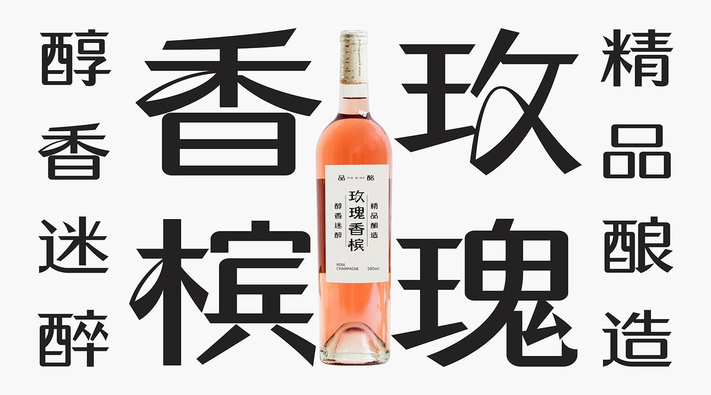
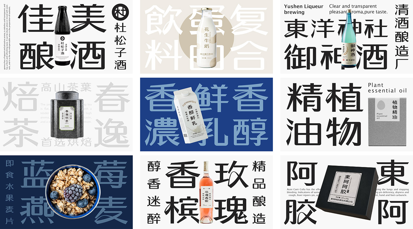
这款字体以传统黑体与标题体为原型,在传统的基础上,横笔画融入了斜切的设计,笔画转角处多用圆角,整体更显几分亲和细腻。并且在“撇”和“捺”的笔画上融入了连笔的设计,使字体在兼具现代简约的同时增添了几分韵味。
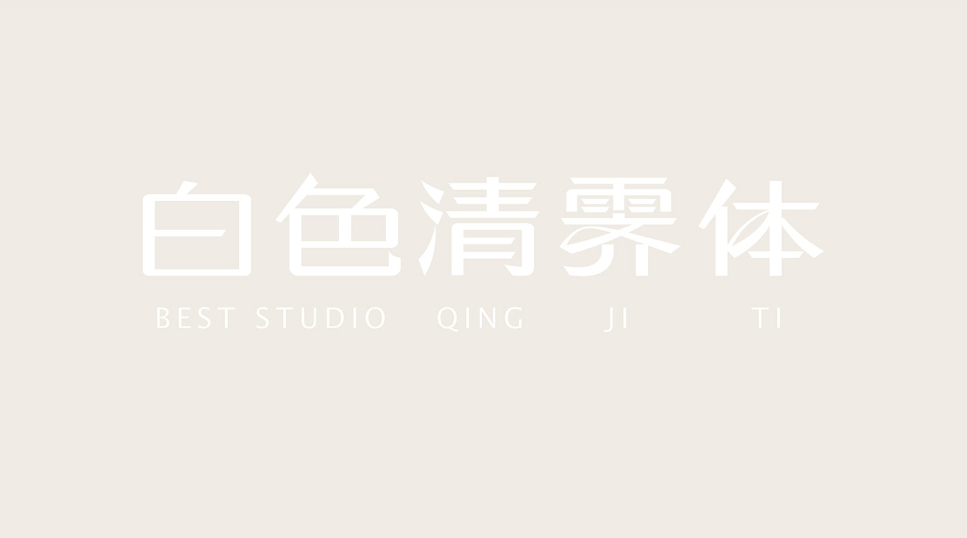
整体字型扁正清韵, 正如这款字的名字一样,云开见清霁,清韵意犹长。适用于包装产品、KV设计等场景。
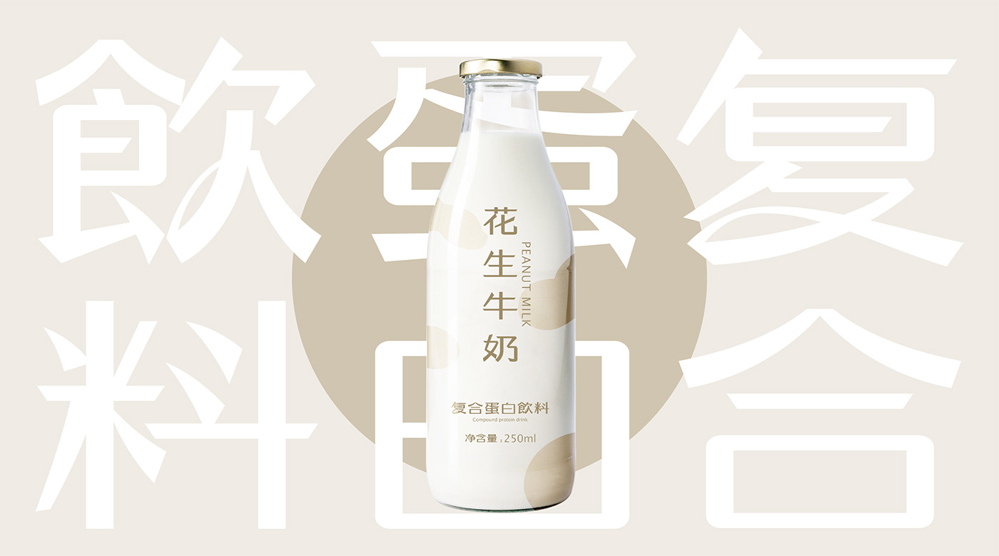
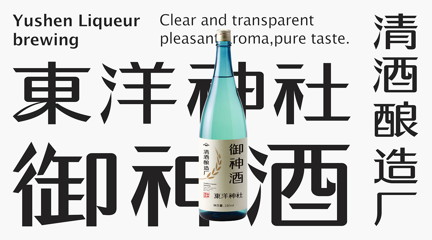
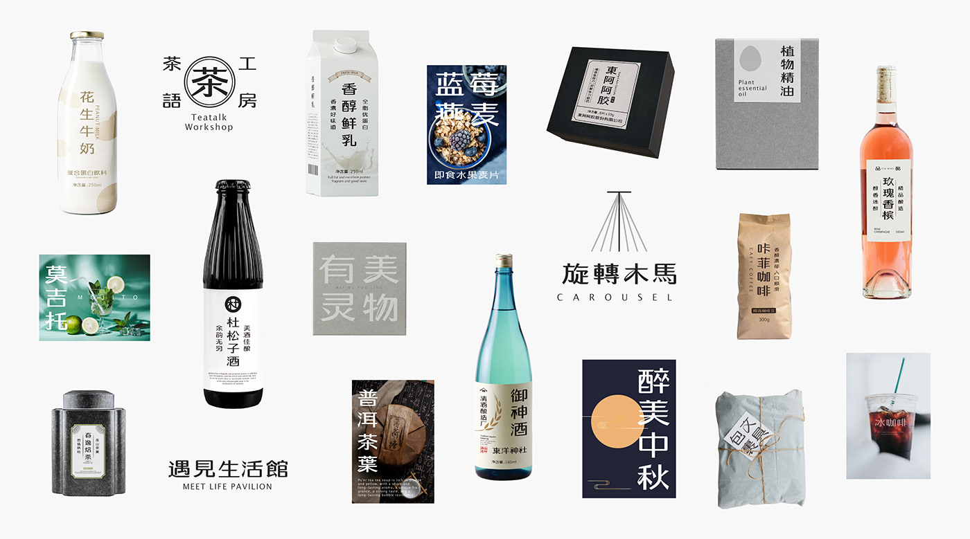
本次为该字型的产品包装应用示例篇。
本次使用图片仅为字体展示效果,只作示例,不作任何商业用途
这款字体以传统黑体与标题体为原型,在传统的基础上,横笔画融入了斜切的设计,笔画转角处多用圆角,整体更显几分亲和细腻。并且在“撇”和“捺”的笔画上融入了连笔的设计,使字体在兼具现代简约的同时增添了几分韵味。
整体字型扁正清韵, 正如这款字的名字一样,云开见清霁,清韵意犹长。适用于包装产品、KV设计等场景。
本次为该字型的产品包装应用示例篇。
本次使用图片仅为字体展示效果,只作示例,不作任何商业用途
Earlier, I wanted to design a headline, which could not only be suitable for product packaging or scene headlines, but also have design aesthetics.
This font is based on the traditional boldface and title body. On the basis of tradition, the horizontal strokes are integrated into the oblique design. The corners of the strokes are mostly rounded, and the whole is more friendly and delicate. In addition, the design of continuous strokes is incorporated into the strokes of "Skip" and "Na", so that the fonts are modern and simple while adding a bit of charm.
The overall font is flat and clear rhyme. Just like the name of this word, the cloud is clear and the rhyme is still long. Suitable for packaging products, KV design and other scenarios.
This is an example of product packaging application of this font.
(The pictures used this time are only for font display effect, only for example, not for any commercial use)


Canwei Lai
Guangzhou Graphic Designers Alliance (GGDA)/ Member
Foundertype / Signed Designer
Art direction / Brand designer
Guangzhou Graphic Designers Alliance (GGDA)/ Member
Foundertype / Signed Designer
Art direction / Brand designer
Graphic Design Consultant
WeChat:lai_canwei
E-mail:542759954@qq.com
www.behance.net/canwei_lai


